Campaign Merchandising
Strategic floor merchandising focused on creating foot traffic, highlighting key products, and maximizing sales through balanced assortments and visual presentation
♡♡♡
♡Nike x Aritzia ♡
Objective
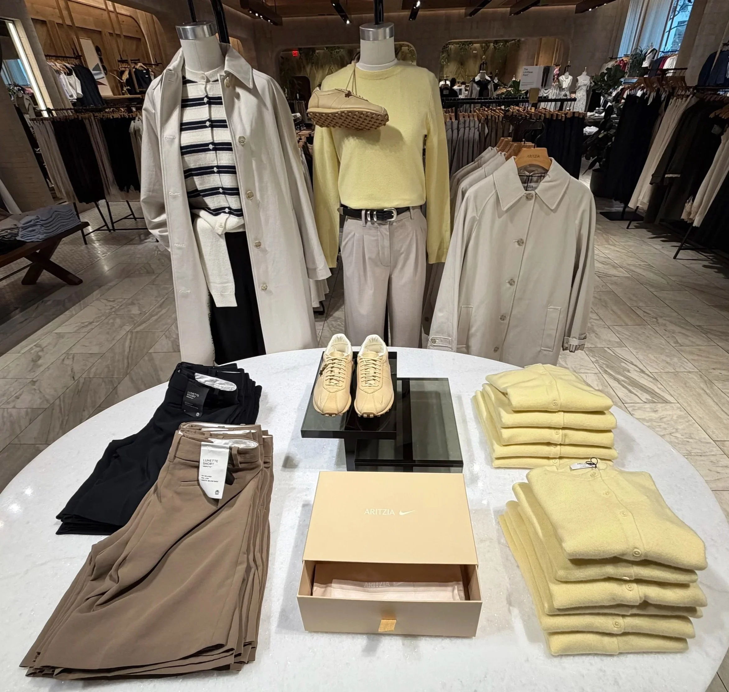
Execute the the Aritzia × Nike collaboration while showcasing key apparel, footwear, and outerwear in a cohesive lifestyle story.
Approach
Developed a soft neutral color palette using cream, taupe, black, and pale yellow to create a fresh, elevated transitional presentation.
Styled mannequins to show complete outfits, incorporating layering, accessories, and footwear to inspire customers.
Positioned the Nike footwear on elevated risers to establish a clear focal point and emphasize the collaboration.
Organized folded knitwear and bottoms by color and category to maintain visual balance and simplify the shopping experience.
Featured hero outerwear pieces on mannequins and adjacent fixtures to highlight layering options and key seasonal styles.
Maintained symmetry and open spacing throughout the table to create a clean, luxury presentation while ensuring all products were easily accessible.
♡ Lucia Pizza x Aritzia ♡
Objective
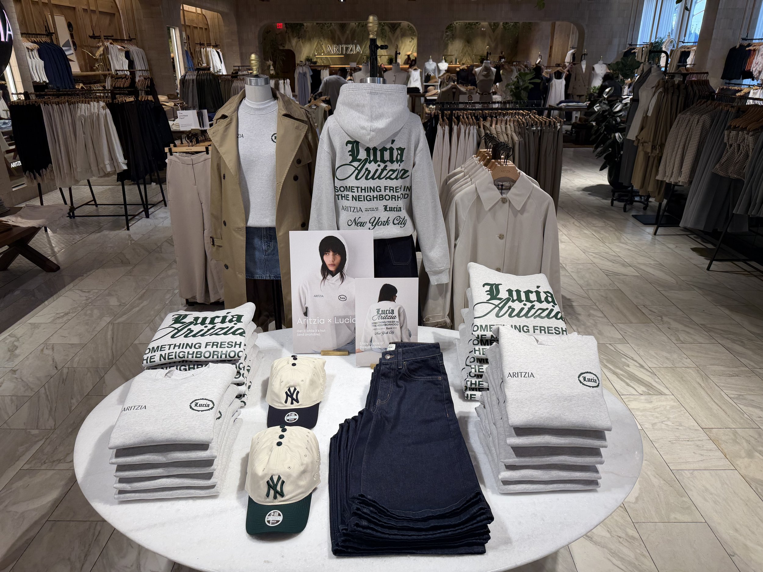
Highlight the Aritzia x Lucía collaboration while communicating its New York-inspired identity and core product assortment.
Approach
Built the display around hero collaboration pieces, including graphic hoodies, denim, and accessories.
Styled and positioned mannequins to provide clients with outfit inspiration and different points of view.
Repeated signature collaboration graphics and branding throughout the display to strengthen visual recognition.
Maintained symmetry and clear product organization to maximize shopability.
♡ Salt & Stone x Aritzia ♡
Objective
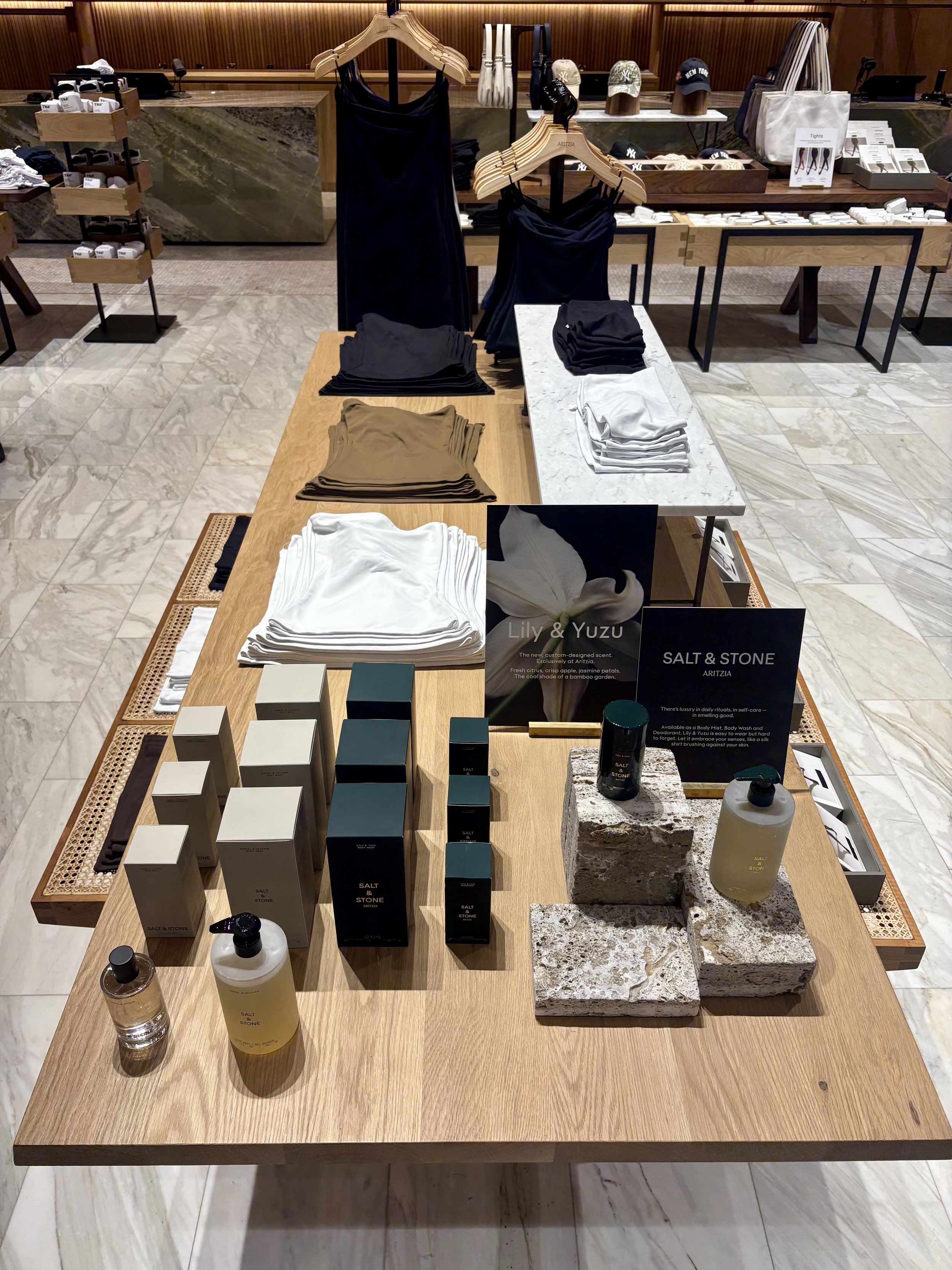
Introduce Salt & Stone as a complementary lifestyle category while creating a clean, elevated presentation that reflected the brand's minimalist aesthetic and integrated seamlessly with the surrounding apparel assortment.
Approach
Developed a neutral color palette using black, white, and taupe apparel to complement the Salt & Stone packaging.
Incorporated natural stone risers to add dimension and reinforce the brand's premium, wellness-inspired identity.
Organized products by category and size to create a logical, easy-to-shop experience.
Used varied product heights and balanced spacing to establish a strong focal point and visual hierarchy.
Positioned campaign signage centrally to communicate the product story while maintaining a clean, uncluttered presentation.